
Role: UX Design & Research
Timeframe: Three Weeks
The Goal
Our goal was to understand what works well already while identifying pain points to uncover opportunities to make the online meal planning and ordering process faster, easier, and more enjoyable for users.
The Approach
Usability testing with 10 participants.
Heuristic evaluation to assess the website against usability principles.
Data analysis to identify patterns in user behavior and feedback.
Key Findings
Premature Payment: Requiring payment before meal customization created significant user frustration and a sense of lost control.
Information Clarity: Unclear terminology and insufficient information hindered users' ability to make informed decisions.
Navigation and Discoverability: Hidden sign-up options and poorly placed discounts led to user frustration and increased task completion times.
Recommendations (At a Glance)
Prioritize User Control: Empower users with customization options before requiring payment.
Enhance Information Clarity: Provide clear explanations and tooltips for unfamiliar terms and payment details.
Optimize Navigation: Improve the visibility of key features and ensure intuitive information architecture.
Improve Accessibility: Increase font sizes and ensure critical information is easily found.
Team: Pheonix Mullan, Lina Penuela, & Wajiha Ahmed
Methods: Data Analysis, Heuristic Evaluation, & User Interviews
Executive Summary
This case study details a usability evaluation of HelloFresh's online meal planning and ordering process, conducted as part of a usability testing course at Humber College. Our team aimed to identify and address critical pain points, ultimately streamlining the user journey for a faster, easier, and more enjoyable experience. Through user testing and analysis, we uncovered key areas for improvement, providing actionable recommendations to enhance user satisfaction and drive business growth.
Methodology
We employed a structured usability testing approach to evaluate HelloFresh's website, focusing on core user tasks. Our methodology comprised:
Pre-analysis: Defining critical user and business goal-oriented paths.
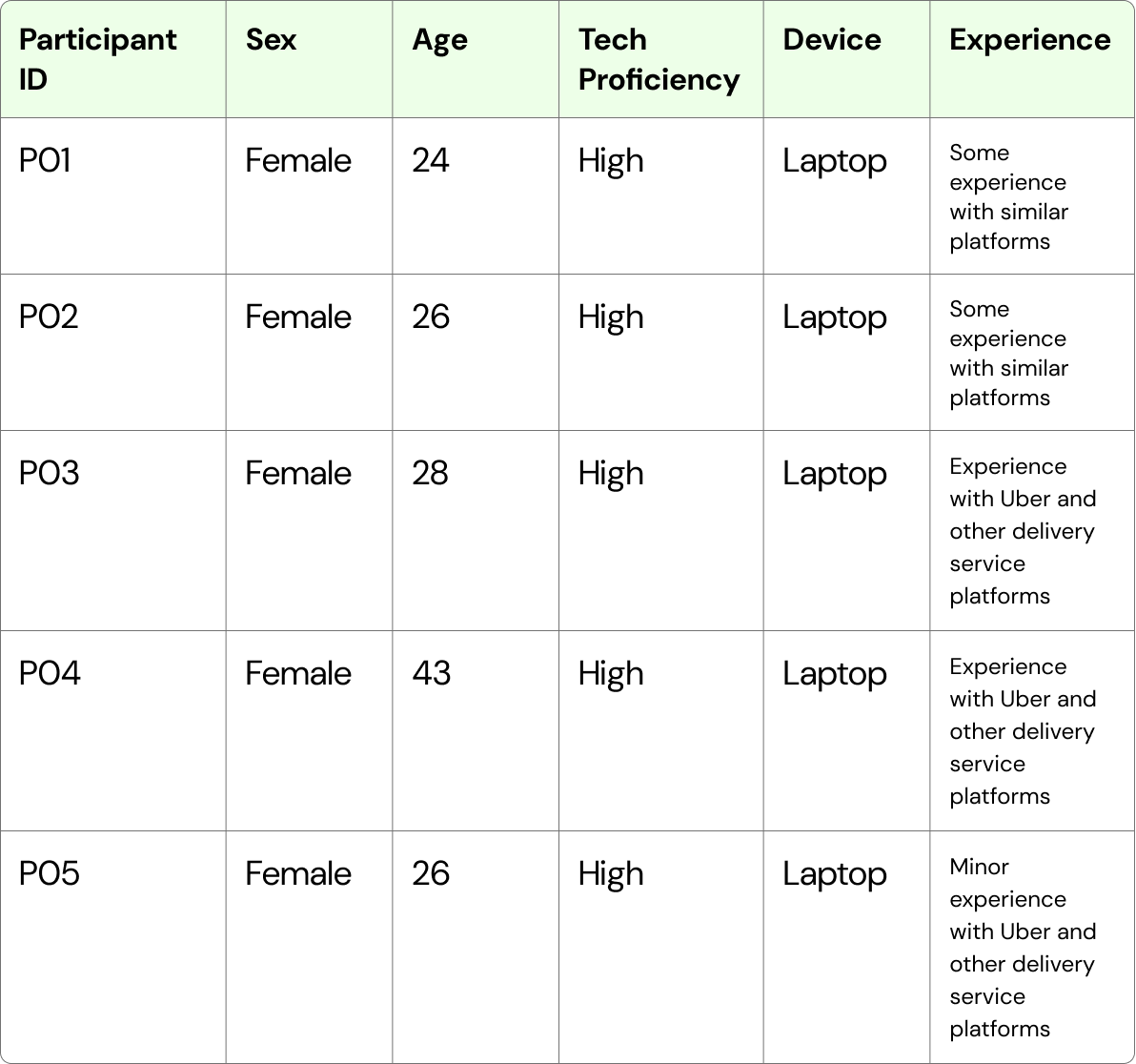
Participant Recruitment: Enlisting 10 external participants, all experienced meal delivery service users.
Usability Testing: Conducting 5 recorded sessions with defined roles (Participant, Moderator, Note-taker), covering account creation, meal planning, customization (pescatarian), and discount discovery.
Data Analysis: Consolidating data, analyzing task completion rates, identifying patterns, and conducting heuristic evaluations.
Participants
Our participants consisted of classmates with experience using meal delivery services, ensuring relevant and insightful feedback.

Data Analysis
We analyzed each task by identifying common themes in user behavior and connecting them to established usability principles. This approach allowed us to justify our recommendations for improvement. Check out this LINK to see our consolidated findings.
Categorization
Data is divided into positive insights and negative insights:
Positive: Indicates a satisfactory or smooth user experience.
Negative: Highlights factors that contribute to friction, confusion, dissatisfaction, or reasons for non-completed tasks.
Impacted Heuristics:
Each negative insight is mapped to usability heuristics that were violated.
Labeling Themes
We categorized insights into broader themes such as 'User Flow Interruptions,' 'Clarity and Comprehension,' and 'Consistency Issues.'
This provided a high-level overview of major problem areas and opportunities for improvement.
Task 1: Create an account
✦
Task 1: Create an account ✦
Averages:
Completion Rate: 100%
Completion Time: 1 minute
Severity Rating: 3/4 - low severity
“What if I’m alone? Then I’m forced to buy more than I want.”
User Control & Freedom: Users experienced a loss of control when redirected to the checkout process after account creation.
Summary:
Account creation on HelloFresh was largely successful, with participants finding the process intuitive and appreciating the convenience of social media sign-in options. However, several participants struggled to locate the sign-up button, indicating a discoverability issue. The lack of two-factor authentication raised security concerns, and the immediate redirection to the checkout page after account creation caused confusion and a feeling of lost control.
Key Findings
Critical Security Gaps: The absence of confirmation emails and two-factor authentication raised serious security concerns.
Poor Discoverability: Participants found the sign-up option's location unintuitive, indicating a significant discoverability issue.
Disruptive User Flow: The unexpected checkout redirect created a jarring experience and led to user frustration.
Error-Prone Feedback: Confusing cart-related feedback, compounded by the disrupted user flow, resulted in user errors.
Impacted Heuristics
Recomendations
“On the homepage, there was nothing like create an account or” sign up”
Visibility of System Status: The absence of a verification or two-step authentication process left users uncertain about the security and completion of the task.
Enhance Security Measures: Implement two-factor authentication to meet user expectations and increase trust in the sign-up process.
Improve Navigation and Discoverability: Make the sign-up process more obvious and easy to find on the homepage or through a clear call-to-action button.
“I want my meal plan first, and then I want to check out, not before.”
Recognition Rather than Recall: Some users struggled to locate the sign-up, indicating an issue with the discoverability of the feature.
Refine User Flow: Ensure users are not redirected to the checkout process unless explicitly intended. Provide clear feedback and maintain user control.
Clarify System Feedback: Improve cart feedback to prevent errors and align user expectations with system actions.
Task 2: Create a meal plan that suits your needs
✦
Task 2: Create a meal plan that suits your needs ✦
Averages:
Completion Rate: 0%
Completion Time: Undetermined.
Severity Rating: 1.8/4 = High severity
Summary:
The rigid structure of the meal plan creation process resulted in a zero percent success rate. Participants were unable to proceed due to the inability to select odd numbers of servings, the inability to find customization features, and the requirement to pay before seeing what they were purchasing. This lack of transparency and flexibility led to significant user dissatisfaction.
Key Findings
Customization Discoverability: Users failed to find meal customization, mistaking the recipes page for meal selection options.
Rigid User Flow: Payment was enforced before customization, disrupting the user flow.
Limited Customization: Odd-number servings were not allowed, restricting user choice.
Information Gaps: Unclear terminology (“smart calories") created confusion and delivery times were not provided.
Security and Control Violations: Users were denied control over meal selection until after payment.
“I feel like I had to pay first before actually seeing what I was getting.”
Impacted Heuristics
“I want my meal plan first and then I want to check out, not before.”
“So everything happens after I sign up?”

Visibility of System Status: Contrary to user expectations, meal customization was only available post-payment, leading to confusion and wasted effort. Additionally, the lack of delivery time information prevented users from making informed purchase decisions.

Recomendations
User Control and Freedom: The system restricted user control and freedom by forcing payment before customization and offering limited serving options.
Flexibility (High Severity):
The system lacks customization options, forcing users to follow a rigid sequence of steps. However, this structure could ensure a proper order and provide a smoother overall experience with a proper sequence of steps.
Error Prevention (High Severity):
Since the system requires payment before allowing meal selection, users are at risk of purchasing items they do not want or being unable to adjust the quantity of meals, leading to potential errors.


Information: Offer clear and detailed information on the same page where users finalize their purchase, including step-by-step instructions, delivery times, and a breakdown of what the payment includes.
Labeling: When using terms that are common in the culinary world but unfamiliar to the general public, include brief explanations or tooltips below those terms to help users understand them.
Data Permission or Confirmation: Confirm with the user before auto-filling personal data to ensure they are comfortable with the system's use of their information.
Flexibility and Customization:
Offer options for odd numbers of servings and specify any minimum purchase requirements. While it may be a business strategy to restrict meal customization until after payment, consider one of the following approaches:
Allow users to customize their meals before proceeding to checkout, with detailed information about what they are paying for.
Provide enough information about the service’s value and what it includes so users feel the payment is justified before selecting their meals.
Task 3: Customize your plan as if you were a pescatarian
✦
Task 3: Customize your plan as if you were a pescatarian ✦
Averages:
Completion Rate: 100%
Completion Time: 1 minute & 15 seconds
Severity Rating: 2/4, moderate severity
Summary:
Users struggled to find meal customization, often confusing recipes with customizable options while experiencing a rigid navigation flow that forced payment before customization. Dietary options, like "pescatarian," also caused confusion due to unclear labeling and varying user familiarity, hindering efficient task completion.
Key Findings
Confusing Process: Participants had difficulty finding the meal customization option, some mistakenly selected meal options that turned out to be recipes rather than the intended customization feature.
Navigation Issues: The system requires users to select the number of meals and days, create an account, and proceed to payment, often without offering the opportunity to customize their order
Challenges with Pescatarian Meal Options: Usability tests revealed inconsistent results when users attempted to find pescatarian meal options. While some users located the options quickly, others struggled, partly due to unfamiliarity with the term “pescatarian.” Despite an explanation (“primarily plant-based but includes fish and other seafood”), this lack of understanding increased the perceived severity of the issue. Users who were already familiar with the diet completed the task more efficiently.
“I like how it gives you the option to change stuff.”
Impacted Heuristics
“I think it was pretty easy. But also I don’t really like again how the menu options are at the end and I can’t really see them before purchase.”
Help & Documentation: Given that our study found some users do not know what a pescatarian diet is, we noticed HelloFresh does not provide a clear explanation of what this diet consists of, ultimately creating roadblocks for users trying to complete this task.
Aesthetic and Minimalist Design: As mentioned a user pointed out that accessibility is an issue when finding pescatarian meals. Where in the font weight and size were not legible enough against the competing information (images and text) on each page.
Error Prevention: HelloFresh does not indicate to users that they need to provide a payment method before they can view all meal options.
Recomendations
Information Accessibility: Add an information icon in areas where users may need clarification, such as an explanation of the term “pescatarian.”
Reduce Page Clutter: Break out related content into separate pages to create more manageable, bite-sized sections, making the site easier to navigate and process.
“OK, I would probably view the menus and see what kind of meals they have.”


Improve Typography: Increase font weights and sizes, especially for grouped information or elements that compete for user attention, to improve visibility and readability.
Streamline User Expectations: Introduce a modal or popup before users access all meal options. This should clearly outline required actions (e.g., providing a payment method) so users understand what is needed to proceed.
Task 4: Find the Youth and Seniors Discount
✦
Task 4: Find the Youth and Seniors Discount ✦
Averages:
Completion Rate: 100%
Completion Time: 1 minute & 30 seconds
Severity Rating: 3/4, moderate severity
“This is a really awkward place to put the seniors discount.”
Impacted Heuristics
Summary:
Finding the ‘Youth and Seniors Discounts’ on the HelloFresh website was straightforward, however, participants felt the placement of the discount was inconvenient, and violated user expectations. Participants expected offers to be advertised in the header or placed on the homepage, however, they were not able to instantly find the offers until they scrolled to the footer. Once located, participants found the next steps to be easy and a logical process. Overall all participants found the task to be smooth enough but disappointed in placement and voiced concern regarding accessibility for senior users.
Key Findings
Visibility and Usability Issues: Discounts were difficult to find due to poor visibility. The 'Get Offers' buttons were easily overlooked, and the footer placement of 'Youth and Seniors Discounts' was considered inconvenient and poorly positioned.
Accessibility Challenges: Font size and discount placement within the footer will be inaccessible to senior users due to navigation challenges and possible lack of technology experience.
Visual Appeal: The website is visually pleasing as it successfully indicates what the business is about through aesthetically pleasing design.
Steps After Finding Discounts: The following process after clicking the discounts link is easy, straightforward, and logical.
“Do they offer discounts? They don’t seem to advertise it.”
Visibility of System Status: ‘Offers’ were easily overlooked or missed due to its lack of visibility, leading users to take longer scanning and scrolling through the page.
Accessibility: Discount placements and small font sizes lead to confusion and some frustration as users expect to access important information in the header or more clearly on the home page.
Flexibility and Efficiency of Use: Despite participant’s technical proficiency, the discount location raised accessibility concerns, particularly for seniors and less experienced users who may find the task significantly harder
“It says youth & senior discounts” but there’s also student and essential workers. That’s kind of confusing. Some people won’t even know they might qualify and ignore the tab.”


Conclusion
This usability study revealed critical areas for improvement within the HelloFresh online experience. By addressing navigation issues, enhancing information clarity, and prioritizing user control, HelloFresh can significantly improve user satisfaction and drive business growth. Implementing these recommendations will foster user trust, increase customer retention, and attract new users, ultimately leading to higher sales and long-term success.